( BRAND STRATEGY ) ( BRAND IDENTITY ) ( PACKAGING DESIGN ) ( BRAND ACTIVATION )
Goulburn Valley
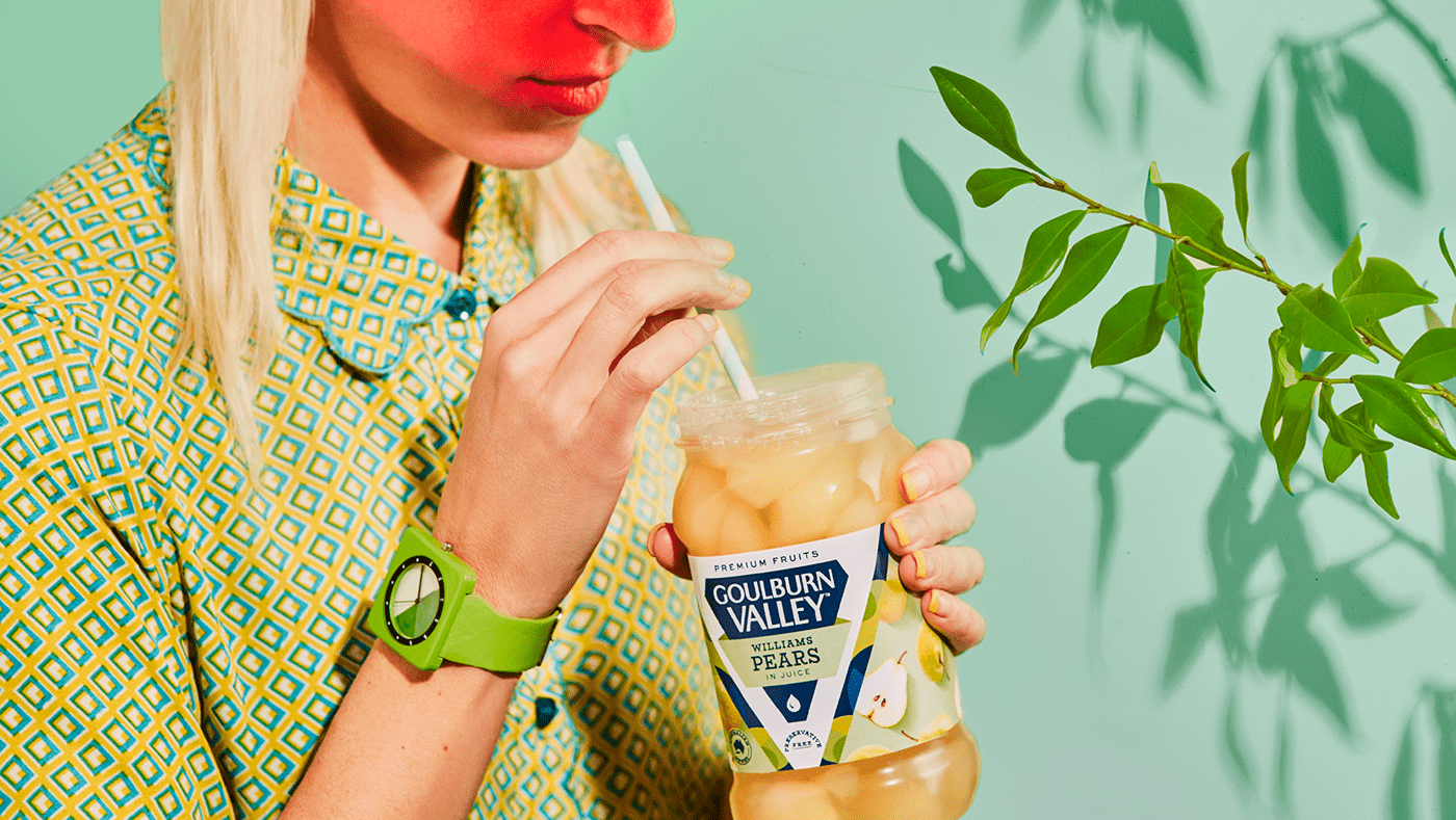
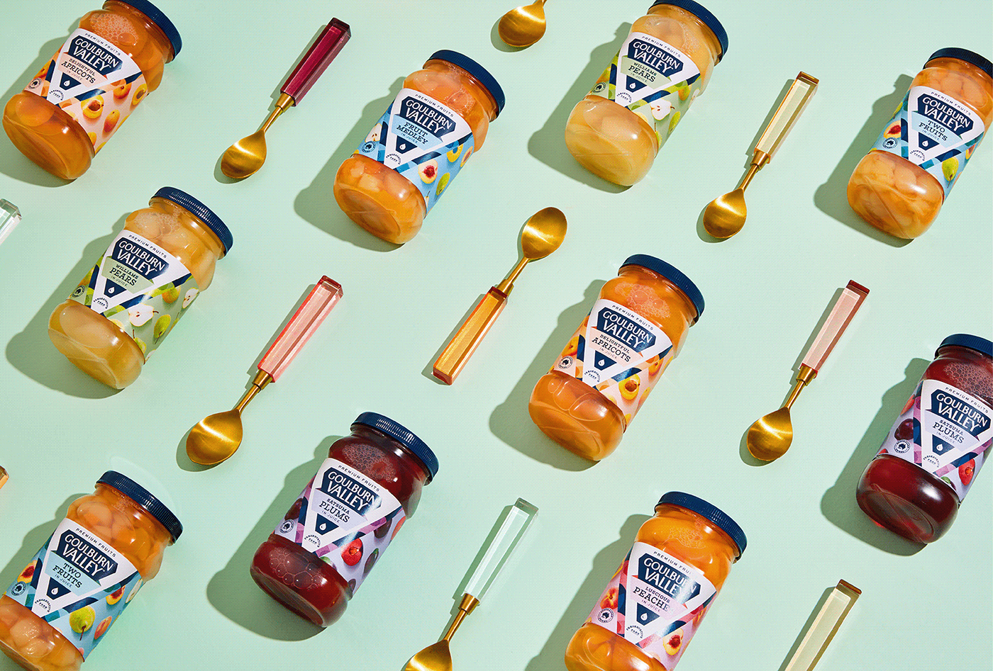
Goulburn Valley is a heritage fruit brand beloved for generations, capturing the essence of a region brimming with natural bounty. Here, the sun-kissed soil, the crisp air, and the warm sun combine to create the perfect growing conditions for fruit that simply tastes better. With new owners guiding the brand, we looked to reignite the nation's passion for the fruit of Goulburn Valley and restore this icon to its rightful place as the premium choice in preserved fruit.

(THE CHALLENGE)
With new ownership, daring aspirations and expansion plans emerged for the brand. Our task was to craft a revitalized identity that positioned Goulburn Valley as a top-shelf fruit brand, standing out from the competition and forging a unique path for growth into uncharted categories. We envisioned a fresh perspective on preserved fruit, and sought to unleash our vivid imagination and offer new, imaginative ways to savour its flavour.


(THE SOLUTION)
The label design plays out the story of a lone agave farmer, meticulussly harvesting his crop. Through a customary etched illustration, the encompassing agave landscape around him is captured. A wash of vivid yellow brings warmth and stand out when on shelf.
The brand marque typography was crafted at scale to provide more impact, whilst supporting lettering heightens the elegance in first impressions. Intricate detail and assets that reflect the rich cultural heritage of Mexico are added to evoke the spirit of Tequila town and its history. Ultimately delivering a design that helps the tequila liquid exceed expectations and exude craft.


